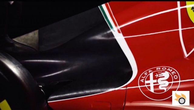
Now that we are a couple of long weeks to meet the new Giulia, the D-segment sedan that will serve as the starting signal for the refounded Alfa Romeo FCA, worthy rival of BMW, Fiat promises, we have been able to see, thanks to a slip of Alfa Romeo italia computer, the new logo of the firm.
It turns out that the logo that appeared on the hood of the F1 was not the same as the one that had been used until now, but the lack of color made it somewhat complicated to interpret. But at the end of last month, for two days the logo on the Alfa Romeo website in Italy was replaced by a new version that was removed on June 1st.
The new logo is the one you see above. It changes little, to be honest, with respect to the logo we are used to, things as they are, but it changes enough to renew itself, eliminating the vertical line of separation between the two sides of the main circle, so that now the bevel reaches the cross of St. George. It also changes the chromatic definition of the elements, and the typography, using a finer one.
The gold disappears in the borders between elements, to give place to a silver tone, leaving the background completely white. We leave here below the current badge for you to draw conclusions.