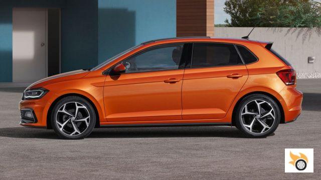
As you already know, the new Polo shares a platform with the new Ibiza. Well, in reality, the image of a car depends mainly on its proportions, and to a lesser extent on its styling (the aesthetic language with which surfaces are treated), and the new Polo is based on a new platform that sits on a larger track and wheelbase. This translates into a car that looks better "planted", which suggests to the viewer stability on the road, robustness and a certain masculinity... in short, the new platform means that the new Polo looks "more car" from the outset.
The difficulty of designing a VW Polo
It is logical, designers have certain limitations when approaching the design of a new car, the first are completely logical and are based on technical, functional and economic aspects, and the second -more opinionated-, refer to the brand image, and the image that the marketing department wants for the new car, and this is where the designers of the new Polo will have encountered significant restrictions:
- The new Polo should still look like a Polo.
- VW has always wanted to avoid very expressive designs for the Polo. Firstly, to differentiate itself from a competition that tends to opt for bold and dynamic - if not feminine - designs, and secondly, to appeal to customers with more classic and discreet tastes. It is clear that VW wants to give an image of a "serious" brand, suggesting German quality.
- The car had to look a bit more masculine and serious, which makes me think that until now, the Polo's main audience was mainly female.
- VW's current design language should be respected, although the Polo should be differentiated to some extent from the Golf, so as not to cannibalize its big brother.
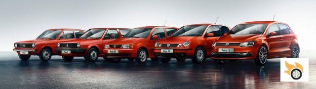
The silhouette of the new Polo, with its short overhangs and steeply sloping rear window, is dynamic and reminiscent of the first-generation Polo. The sharply defined wheel arches also suggest strength and - due to the visual comparison our brains make - visually lower the height of the car. The rear window -with its sloping lower line- also adds some dynamism, picking up on this theme from previous generations and helping to differentiate it a bit from the Golf.
I like the silhouette and volumes of the Polo, because they are clearly focused on functionality, allowing an interesting habitability, brightness and visibility from inside, and all this without forgetting to suggest a certain dynamism.
The design language, on the other hand, tries to achieve a certain balance between the "family feel" and the necessary differentiation. In this sense, I think the front end is too reminiscent of the Golf, which is also a bit overloaded. As an example, I think it's unnecessary that small piece in body color that has been placed on the grill and that is the continuation of the hood. More lines does not mean a better design. Be that as it may, it looks like the current VW design trend: lots of horizontal lines all over the place, and the more the better.
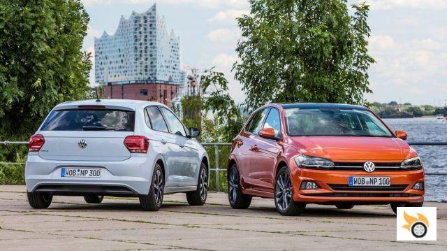
Personally, I would have preferred a cleaner front end with more personality, and I think that could have been achieved without sacrificing the brand image. I don't think it would have been difficult to design a grille and light clusters reminiscent of the Polo with round and/or double headlights, while maintaining some contact with the current language of the brand, and distancing it aesthetically from the Golf and thus avoiding a certain cannibalization...
Fortunately, not everything is boring in this Polo, and originality comes from the hand of an interesting -although somewhat forced- ribbed surface at the height of the hands. It's an element that adds a certain character and gives a sense of solidity, helping to lower the visual height. The small problem -in my opinion- is that the side view looks a bit overloaded, because a little above it there is also a line on which the windows "rest", and that continues forward...
It is also interesting how the surface of the rear lights forms a kind of step, a step only visible from certain angles, and that is a certain boldness that does not risk his older brother.
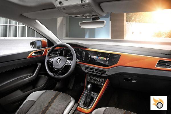
In terms of interior design, the new Polo is an interesting evolution. Not that its design is groundbreaking, but if we find a certain desire to add movement to the monotony of previous generations. The whole looks very tidy and is quite elaborate, suggesting a higher category. I don't like the position of the multimedia screen, as it forces you to look away from the road too much, but the new digital dashboard will partly compensate for this problem, offering some navigation instructions.
The new Polo will have one of the most complete digital dashboards in its class (depending on equipment).
I like interiors with a horizontal design. A detail that shows VW's interest in designing a Polo that appeals to different audiences is the possibility of opting for trims for the dashboard and door panels in different finishes and colors, which will please both those looking for an expressive and colorful interior, as well as those looking for a discreet and elegant or sporty image.
For all tastes
When we give our opinion on the design of a car, we tend to do so based on our personal tastes, and so it is easy to end up criticising a model for being either too conservative or too modern and expressive. Obviously, this Polo is not for those who are looking for a car with a modern and innovative design, it is a car for those who prefer a discreet image and that makes it clear that it is a VW, a brand that has a certain "semi-premium" halo that has to take care, because it allows you to sell their cars at prices higher than those of the competition.
Personally, and although the design of this new Polo doesn't say much to me -I still think that with a more personal front end it would gain a lot-, I think its designers have achieved the goal of designing a more masculine Polo that can reach a wider audience. Also, the packaging of the car is excellent, having achieved very good habitability, visibility and trunk. I'm sorry, but I can't help but think of some of its competitors that sacrifice visibility and/or roominess in favour of more expressive designs...
There is only one downside to the practicality and logic of its design: the total absence of unpainted protections on its bumpers and body sides, something absurdly common nowadays in most cars designed for city use.
In short, it's a car with an honest design, its image suggests what it is: a quality car that puts practical aspects first, and doesn't try to fool anyone. Have I already said that a front end with double headlights would have been great?