Interestingly enough, back in the day things were not like this. In fact, if one looks back, one wonders how North American customers have allowed and requested interiors that have lost everything, absolutely everything, their appeal of decades ago.
Let's take a brief look, with specific examples, at the strange process of improvement, achievement and decline suffered in the big three.
I once heard a customer say a completely realistic sentence. You might buy the car for its exterior lines, but the reality is that you're going to spend most of your time with it sitting inside, so it should be more important what it looks like in there than what it looks like on the outside, because the outside is what others will see?
The other day Motorpasión published a curious and recommendable article about the origin of the term "dashboard" (you can read it here). The early days of motor vehicles with forms already similar to what we understand today by a car were limited to install a simple dashboard in front of the driver, with a few clocks to indicate important parameters of the operation of the mechanics.
Those were times when reliability was not taken for granted, and monitoring the alternator charge, oil pressure or coolant temperature was vital and mandatory. In more basic and economical models, which are the ones we are going to focus on in this report, with very tight budgets, there was no money even to have instruments, so everything was reduced to show an interior where the panel that went under the windshield was a varnished wooden board, located behind the steering wheel.
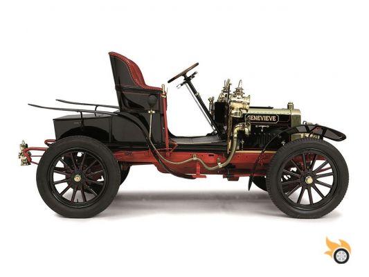
1912 Ford Model T
In the 1920s even the cheapest cars could incorporate a clock and instrumentation. The design of the dashboard then began to evolve from something completely simple and functional to something more elaborate.
Inspired by the wooden furniture of the time and Swiss clocks, American car manufacturers, like those in the old continent, opted to integrate the clock panels as if they were a kind of jewellery ornament in their panels behind the steering wheel.
Ford Model A 1929
The evolution continued unstoppable towards the Second World War, and at the dawn of it we began to see dashboards already really worked in its design, incorporating a certain degree of goldsmithing, with decorations that, although they were not necessary, they helped to give the interior of the vehicles a certain aspect of typical design in the architectural interior design of the time.
Thus, reminiscent of radios and jukeboxes of the time, we can see more elaborate and better finished interiors.
Chrysler Imperial Business Coupe 1937
One of the most striking interiors that we have found by pulling the newspaper archive has been the one used by Ford in its V8 Deluxe of 1942 (image below), where the aesthetics reminds us of a Jukebox just after the Second World War, by the curves, the mix of chrome and the selection of colors and materials.
Ford V8 Super Deluxe Station Wagon 1942
But the big leap in design came shortly after the end of the Second World War. With young men returning from the military front and a love of jet fighter planes, automotive trends and futuristic visions captured the minds of a whole generation of designers, eager to explore jet-inspired themes to decorate car dashboards.
In any case, before going to that extreme, more simplistic designs, like the Ford Custom below, would hit the market with body-coloured metal panels and a certain minimalism in the form of a single, but very elaborate, three-dimensional clock.
There was no overload of elements, but everything looked, and looks, appealing to the eye and to the touch.
1949 Ford Custom Coupe
The profusion of chrome, multiple clocks on multiple planes, and the design inspired by the aerodynamics of fighter planes (not just for the big-tailed exteriors) can be seen perfectly in the Cadillac sixty-two in the image below.
In it we can also highlight the choice of the color "sea water" for many elements, the dashboard format "bar bar" that was shaped as a shelf that rotated with the panoramic windshield, also fashionable at the time.
Cadillac Sixty-Two 1958
Horizontal speedometers, rather than circular ones, would also catch on as a trend beyond the United States. In fact, curiously, the trend of exporting design styles from the United States to Europe would prevail, with models such as the Simca 1000 or the Renault 8 copying ideas of what in America, on a much larger scale, worked commercially.
Cars like the Ford Thunderbird took a different route, with less chrome, although retaining the idea of the flat dashboard in the form of a bar bar accompanying the panoramic window.
1957 Ford Thunderbird
The use of leather and light colors and the multiplicity of clocks continued to demonstrate a love for interior design and the elaboration and decoration of the interiors, with a genuine aluminum honeycomb dividing the two heights of the dashboard.
But if there is a futuristic, clock-filled, colorful and marker interior of this golden age of American dashboards, it is that of the C1 Corvette in that early 1960s.
Chevrolet Corvette C1, 1961
The use of the vibrant red color was already eye-catching. The clearly three-dimensional clocks protruding from it, and the auxiliary clocks grouped horizontally behind the steering wheel gave that technical touch and so of the time.
There was no other car like it on the market.
And then came the turning point and the fall with the seventies. The arrival of plastic and vinyl as the prevailing materials in the interiors facilitated a wild reduction in production and assembly costs in the interiors of the vehicles, but also brought with it the loss of care for different materials, colors and complicated designs.
1972 Dodge Dart Demon
The Dodge Dart Demon interior only gave us a foretaste of the (bad) things to come, the trend and taste for straight lines that would soon combine with the digital explosion to give rise to interiors that were either too bland, or tried to show something digital and futuristic, without a result that time has judged as "interesting".
1982 Ford Crown Victoria
The more generalist designs, like this one of the Ford Crown Victoria (the quintessential New York taxi), show a loss of taste for design. The straight lines are imposed, which is not necessarily a bad thing, but they opt for a decoration with a lot of plastic, and fake wood, where the "technological equipment" would be quickly outdated by an attempt to bet too much on a future that we would never get to see.
In performance cars, like the Pontiac you see below (and which would be used as the basis for KITT), things didn't look any better either...
1989 Pontiac Firebird, with curious steering wheel controls
The nineties would bring the reintroduction of the curve to the dashboard theme, abandoning the hard lines imposed in the eighties. But America was then stuck on a path where dashboard design had no place.
Simplicity, ergonomics and economy were sought after, with materials, fittings and formats that were totally poor and uninspiring.
Ford Crown Victoria 1991
Even the bravest attempts to design more daring and sporty things, like the Mercury Cougar of the late nineties (our Ford Cougar) ended badly. And not because the design itself was so bad, but because the use of materials, the fit and finish was unsatisfactory.
What wanted to look like aluminum, was plastic painted in a gray with a very poor touch. The distances between parts and their adjustments, and the use of common elements between models of the same brands took their toll.
1997 Mercury Cougar
The beginning of the century continued to bring attempts to recover design load, as in the Chrysler 300M, with quite a load of forms in its interior, but with a new bad judgment in fits, finishes and materials.
What looked like wood wasn't wood. The plastics were hard, and creaked after a few days of use.
Chrysler 300M 2004
The use of common "OEM" buttons was still too much of an eyesore, and they were forced to look fake, as were the multiple black liquid crystal or LED displays with teal digits, which looked like something out of a €5 digital watch.
The distances between the plastic panels also stood out, and the epically large steering wheels, presided over by the need to integrate large airbags that couldn't be folded down as they can now, didn't help either.
Cadillac CTS 2002, watch out for the center console, which looks like a Mac
Even cars that were a bit European-focused, as a possible answer to imported premiums, like the Cadillac CTS at the end of the first decade of this century, couldn't match what was being done in Europe.
But then there was a sea change. With the financial crisis, with Asian and European rivals tightening the screws on the big three Detroit firms, they decided, at last, to respond, and apply themselves. As if they had agreed at the same time, they decided to abandon the designs more typical of past decades, and bet on trying something better.
2007 Cadillac CTS-V
A perfect example of this radical transformation lived in the last seven years is the radical leap forward made by General Motors in its CTS, which went from having the horrible look you've seen above, to having the cabin you have right in this picture, above these lines, where the interior received a finish that mixed "piano black" plastic with a genuine leather dashboard, a retractable screen, elaborate clocks and a first row adjustment.
Gone were the partition lines between plastic elements. There was no more room for ugly OEM elements in the middle of the dashboard for the climate controls or the radio. Yes, there were still a few too many buttons and elements left over, but that has been cured in the following years.
2012 Cadillac CTS
Evolution now leads manufacturers to try to minimize the amount of physical buttons, after a time when "more buttons meant more technology" (look at the 2002 CTS). American interiors have regained taste, design, character and good finishes.
While we can't predict the future exactly, what Detroit's big three seem to have learned is that in a global market, where foreign products were offering much better interiors than theirs, they couldn't keep creating embarrassing designs, because they would lose customers and suffer the attack of the testers' opinion.
But it is also curious to see how during the sixties the USA was "the cradle of design", the vanguard in ideas for interiors, and in a matter of two decades they lost that leadership to become "the worst of the worst".
Article originally published in April 2014, retrieved for Pistonudos